MORGAN :: History of Graphic Design
Monday, November 29, 2010
Hatch Show Print (extra credit)
Getting to go to the Hatch Show print shop was awesome. Seeing the press in action was mind-boggling. They had so many cool posters there; some were new but a lot of them were really old. There was an amazing Bob Dylan poster there that I would like to get.
Hatch Show Print
Jim of Hatch show came to talk to our class. It was awesome and very informative. It really made me respect wood block printing and I saw it in a new light. I'm seriously considering doing my internship and Hatch now. The whole process is extremely interesting, and every time you make a print, it's like you're holding history in your hands.
Digital
This is the ultimate definition of digital art. All of the Transformers had to be made on the computer. The font portrays the concept of the movie perfectly. The composition and overall design is fantastic.
Postmodern
This Paula Scher image was in my history book. The overall composition is great. The background being made up of slang words against women really pushes the emotional impact provided by the crying eye graphic.
Psychedelic
This is a Grateful Dead poster I found online. The abstract imagery screams Psychedelic. The 2 toned color in the text and the typeface choice are wonderful. Jerry Garcia was tripping hard.
Contemporary
When I saw this Bob Dylan poster in my history book, I knew I had to use it. The hair definitely looks like it was influenced by art nouveau. In my opinion, the font choice and color are perfect. The overall composition is beautifully orchestrated, and the colors are amazing.
Swiss/International
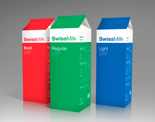
This is an awesome package design I found online. It perfectly encompasses the Swiss/International style. The aligned left text and the bold and thin Helvetica font has Swiss written all over it (figuratively and literally).
Subscribe to:
Posts (Atom)


