Monday, November 29, 2010
Hatch Show Print (extra credit)
Getting to go to the Hatch Show print shop was awesome. Seeing the press in action was mind-boggling. They had so many cool posters there; some were new but a lot of them were really old. There was an amazing Bob Dylan poster there that I would like to get.
Hatch Show Print
Jim of Hatch show came to talk to our class. It was awesome and very informative. It really made me respect wood block printing and I saw it in a new light. I'm seriously considering doing my internship and Hatch now. The whole process is extremely interesting, and every time you make a print, it's like you're holding history in your hands.
Digital
This is the ultimate definition of digital art. All of the Transformers had to be made on the computer. The font portrays the concept of the movie perfectly. The composition and overall design is fantastic.
Postmodern
This Paula Scher image was in my history book. The overall composition is great. The background being made up of slang words against women really pushes the emotional impact provided by the crying eye graphic.
Psychedelic
This is a Grateful Dead poster I found online. The abstract imagery screams Psychedelic. The 2 toned color in the text and the typeface choice are wonderful. Jerry Garcia was tripping hard.
Contemporary
When I saw this Bob Dylan poster in my history book, I knew I had to use it. The hair definitely looks like it was influenced by art nouveau. In my opinion, the font choice and color are perfect. The overall composition is beautifully orchestrated, and the colors are amazing.
Swiss/International
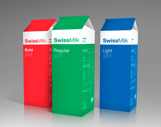
This is an awesome package design I found online. It perfectly encompasses the Swiss/International style. The aligned left text and the bold and thin Helvetica font has Swiss written all over it (figuratively and literally).
Late Modern
Paul Rand pulled a significant amount of weight in the Late Modern movement in America. This is piece that he did that I found in my history book. The pictorial simplicity is phenomenal. It takes extraordinary talent to be able to convey a message that clearly with only one letter.
American Kitsch
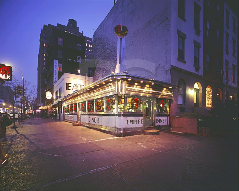
This is a picture I found online of a 50s style diner. The text is very interesting and fits into the American Kitsch movement. This is one of my favorite types of building style. This one building can some up so much of America's history in that era.
Airsoft Pistol (5 of 5 for Final)
This is an advertisement for an Airsoft gun company that I found on the interwebs. I was really surprised to see this ad in a Cubism style. The illustration is strong, but the colors are a little strange looking. The main text is interesting, but I don't feel that it fits well within the entirety of the piece.
Yellow Submarine (4 of 5 for Final)
This is a Beatles album I found online. The characters have a very art nouveau feel with the flat colored objects making up the subjects. The background looks like it was probably influenced by the psychedelic art work that was popular around the albums release. I personally don't like the font choice, but it seems to work fairly well with the overall composition.
Sunday, November 28, 2010
Constructivism
I found this Franz Ferdinand album cover online. It's a perfect example of a modern approach to Constructivism. The typeface choice is an excellent fit for the band and the context of the song.
Monday, November 8, 2010
Zeppelin III (3 of 5 for Final)
This is Led Zeppelin's album cover I found in my collection. The abstract, psychedelic artwork was designed by Zacron, a multi-media artist whom Jimmy Page had met in 1963 while Zacron was a student at Kingston College of Art (http://en.wikipedia.org/wiki/Led_Zeppelin_III#Album_sleeve_design). Behind the front cover is a rotatable laminated card disc, or volvelle, covered with more images, including photos of the band members, which shows through holes in the cover. It has a very abstract/surrealist look throughout the composition. The majority of the images are related to aviation (like the band name Led Zeppelin).
Monday, November 1, 2010
11/1 Mellow Yellow (2 of 5 for Final)
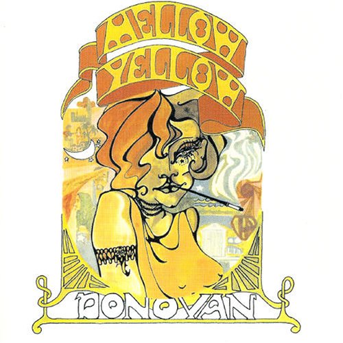
This is an album cover I found in my record collection. It's called Mellow Yellow and was released in 1967 by the artist Donovan. I really like the Art Nouveau influence in the imagery and the Victorian treatment of the text on banners, but the typeface itself is very relevant the the time of it's release . As a graphic designer who would like to design album covers, I often try to find a visual mental image of an atmosphere that the music conveys, and whoever designed this cover hit the nail on the head. When you listen to the album, neither the music or the lyrics come out and slap you in the face. You have to read into what Donovan's trying to say. If you haven't ever listened to this album, I strongly recommend it.
Monday, October 25, 2010
10/25 Graffiti Art (1 of 5 for Final)
I found this image on Flickr. I really enjoy the grungy look of the spray paint. It reminds me of WWII / Cold War propaganda, not really because of the composition or type treatment, just the fact it looks like something that would be painted on the Berlin Wall. It definitely has some Plakatstil influences to it with the use of 2 flat colors. I'm not sure if the words on either side are supposed to be apart of the composition, but I like the atmosphere is induces. I also love the feeling of movement and anxiety of the ballon floating away. Maybe the artist is foreshadowing the coming of something bad, or maybe it's representative of the emotional distress of growing up.
Monday, October 11, 2010
Logos
I really like the idea behind designing logos. It's extremely difficult due to the fact that the designer has to attempt to portray an idea, situation, or an atmosphere in a single, simple image and minimal type. When it comes to designing a logo you must execute it with extreme accuracy and it must read easily. Yamaha's logo works well as a graphic, but what most people don't notice is if you separate the 3 objects, you can see that they are tuning forks. Yamaha make's everything between protective gear to lawn mowers, but they got their start in music. Below, I've added a logo I designed for a Bonnaroo contest.
The Blues
This is The Old Guitarist by Pablo Picasso. Picasso went through what is popularly known as his Blue Period. Throughout this time, he only painted in hues of blue, occasionally contrasted with a warmer color. It's believed that he entered this period of monochromatic painting after a close friend of his committed suicide. I enjoy these painting for their graphic qualities. I often catch myself designing high contrast images with few colors, which I believe to be influenced by his work.
Hatch Show Print
This design has a very Western American feel to it. The biggest contribution to this (other than the cowboy of course) is the use of Rockwell type fonts. The layout is also very 1800s American with the rectangular treatment of the text and skewing of words to make them fit into the rectangular shape. Most of Hatch Show Print's designs are very americana, such as this.
Typography
This design is very interesting due to the treatment of the text to create an image. The font itself screams James Brown style music. The execution of the typographic image is phenomenal. It's clearly James Brown, but the words are readable, and work well with the overall composition. It has Futurism aspects like throwing reason and logic to the side in order to make an image.
Minimalist Movie Poster
I really enjoy the concept of portraying a message with very little visual imagery. This poster shows a series of crayons falling like dominos. In the movie Reservoir Dogs, each character's name is a color (i.e. Mr. Brown or Mr. White). The order that each crayon falls is the same as each character dies in the movie. I would have to assume this falls in the the Minimalism art movement, although it has a hint of Plakatstil.
Subscribe to:
Posts (Atom)


