Monday, November 29, 2010

Late Modern


Paul Rand pulled a significant amount of weight in the Late Modern movement in America. This is piece that he did that I found in my history book. The pictorial simplicity is phenomenal. It takes extraordinary talent to be able to convey a message that clearly with only one letter. 

American Kitsch


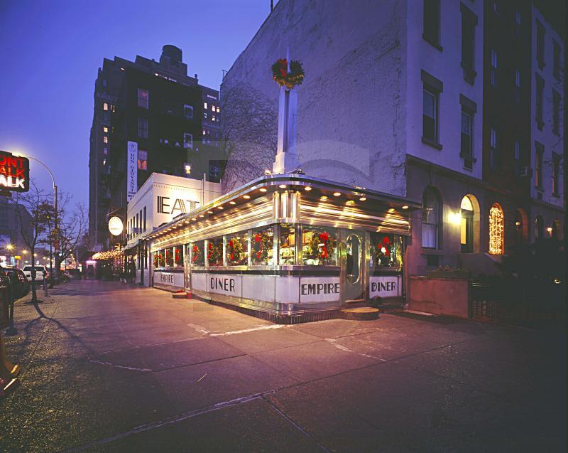
This is a picture I found online of a 50s style diner. The text is very interesting and fits into the American Kitsch movement. This is one of my favorite types of building style. This one building can some up so much of America's history in that era.

Airsoft Pistol (5 of 5 for Final)


This is an advertisement for an Airsoft gun company that I found on the interwebs. I was really surprised to  see this ad in a Cubism style. The illustration is strong, but the colors are a little strange looking. The main text is interesting, but I don't feel that it fits well within the entirety of the piece.

Yellow Submarine (4 of 5 for Final)


This is a Beatles album I found online. The characters have a very art nouveau feel with the flat colored objects making up the subjects. The background looks like it was probably influenced by the psychedelic art work that was popular around the albums release. I personally don't like the font choice, but it seems to work fairly well with the overall composition.

Sunday, November 28, 2010

Constructivism


I found this Franz Ferdinand album cover online. It's a perfect example of a modern approach to Constructivism. The typeface choice is an excellent fit for the band and the context of the song.

Monday, November 8, 2010

Zeppelin III (3 of 5 for Final)


This is Led Zeppelin's album cover I found in my collection. The abstract, psychedelic artwork was designed by Zacron, a multi-media artist whom Jimmy Page had met in 1963 while Zacron was a student at Kingston College of Art (http://en.wikipedia.org/wiki/Led_Zeppelin_III#Album_sleeve_design). Behind the front cover is a rotatable laminated card disc, or volvelle, covered with more images, including photos of the band members, which shows through holes in the cover. It has a very abstract/surrealist look throughout the composition. The majority of the images are related to aviation (like the band name Led Zeppelin).  

Monday, November 1, 2010

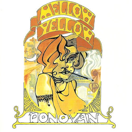
11/1 Mellow Yellow (2 of 5 for Final)


This is an album cover  I found in my record collection. It's called Mellow Yellow and was released in 1967 by the artist Donovan. I really like the Art Nouveau influence in the imagery and the Victorian treatment of the text on banners, but the typeface itself is very relevant the the time of it's release . As a graphic designer who would like to design album covers, I often try to find a visual mental image of an atmosphere that the music conveys, and whoever designed this cover hit the nail on the head. When you listen to the album, neither the music or the lyrics come out and slap you in the face. You have to read into what Donovan's trying to say. If you haven't ever listened to this album, I strongly recommend it.